
In this article, I’ll explore the idea that responsive design means more than responding to screen-size, as well as sharing a few techniques I’ve found useful along the way.
This article is the first part in a series that will look at responsive design and how web technology and the web community have embraced it.
Let’s begin with a very quick overview of responsive design.
As you look back through websites on the Wayback Machine internet archive, you can see how sites have adapted to their surroundings over the years. As screen resolution increased, web designers let their sites gradually widen.
Interestingly, HTML in its rawest form (without CSS) is actually pretty “responsive”.
However it was an article by Ethan Marcotte in A List Apart that caused the web community to take a collective left-turn with the realisation that not everyone was viewing your website on their family PC. As browsers started appearing on mobile phones, it became clear that websites had to adapt.
Firstly, it was indeed that – adaptation. In many cases, a different site was served to mobiles, or – at least – a different CSS file. Web sites “adapted” to their new surroundings.
Gradually, another term emerged – responsive. Rather than have a different fixed-size design served up depending on the screen, websites used a single design that “responded” to changes in the viewport it was contained in.
Part 1: Media Queries
When we reach for responsiveness in our designs, we reach for Media Queries.
For a lot of front-end designers, it’s been more of a saviour than a tool. It’s been a way of fixing the design, rather than building it.
As a result of this approach, they can become overused, and can hit the performance of a site negatively, as well as the ability to debug and make sense of the CSS of a site.
How many times have you found yourself having to “reset” CSS? Removing styles? This is a problem with not approaching your work systematically.
I’m going to provide a few tips that will, hopefully, help you see how thinking about responsive early on can help us use media queries more effectively.
First up, a reminder (or this may be new information) – media queries don’t just query your screen size. More on this later.
Mobile First
You’ve probably heard of mobile-first: designing a site for mobile and then scaling upwards to desktop. Turns out, this is a useful way of thinking about responsive in a sensible fashion.
The initial site (before media queries have kicked in) is the basic mobile, single column version. Since older browsers don’t even support media queries, this can be used as the fallback option too, meaning a usable, if simple, site can be used by everyone at least.
Min over Max
Starting from here and going “upwards” means your media queries go one direction using, as much as possible, the “min” screen size over the “max” where a media query is needed.
See the Pen
eqVNLp by GCD (@chariteer)
on CodePen.
In this example, the navigation by default is stacked and as the screen gets wider, it takes up a horizontal design. For old browsers that don’t support media queries, they will get the mobile version served up.
Ems
There’s a bit of debate around this, and it was largely a result of a bug in Safari, but since that’s been resolved, it’s safe to use “ems” as the media query unit for screen size. Why ems?
Responsive design should not be down to just screen size, it should respond to user preference as well. What ems do is help your site conform to “its” size, as well as the screen size. Sometimes your user might want to zoom in on a page. If the site uses ems in its media queries, it will actually take on the smaller screen size formats as the text size increases. Or in the case of looking at a webpage on a TV, the screen is further away, so you up the text sizes. Em units essentially allow the “mobile” view to kick in here, complete with a simpler layout, no horizontal scrolling etc.
See the Pen
oKEXpW by GCD (@chariteer)
on CodePen.
Breakpoints
How would you decide where your breakpoints go? An early faux pas in this was to look at your devices and design for each one. The problem here, of course, is your devices are likely to be different than someone else’s. The solution is not to design to device sizes, but to introduce breakpoints where the design “breaks”.
I would take this further though, and treat the breaks as places where you want the site to take on a “new” design. Technically your mobile view should work right up to any size of screen, so your breakpoints bring more delight, maybe more pleasant use of the space. Columns come in, the width is taken advantage of, more breathing space added to components, larger text etc. This way, you’re not simply fixing the site for different screen sizes, you’re designing the site to look great no matter how you’re looking at it.
Motion
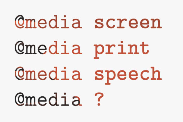
I mentioned earlier that media queries are not confined to screen size. They’re not even confined to screens. Their name implies that they are multi-media. As well as screen, it covers print and speech, and possibly more in the future? (AI?) Here I want to mention something that doesn’t automatically come into consideration when thinking of responsiveness – movement. It may be a case that the user is either in a low-width broadband location, or they might be sensitive to movement on screen. Either way, animation might get in the way of their enjoyment of the site – too long to load, or too distracting.
@media (prefers-reduced-motion: reduce) { … }…means that anything within here can adapt to devices where the user has chosen reduced motion from the settings. On Mac this is changed via the “Reduce motion” checkbox in Settings > Accessibility > Display.
With your progressive enhancement this could be inverted and your animation could be contained within:
@media (prefers-reduced-motion: no-preference) { … }Hover
What about users on touch devices? You may have “hover” states that simply don’t work on touch screen. Another media query, @media (hover) allows you to confine your on-hover changes to devices that support it.
See the Pen
Responsive – hover by GCD (@chariteer)
on CodePen.
Check out this page on a touchscreen device and you’ll see the menu above is a bit different.
Pointer
One more. Your user is on a touchscreen device. A finger is not as accurate as a mouse pointer. Responsive design means you can respond to this, using the “pointer” media query.
@media (pointer: fine)Or
@media (pointer: coarse)If you’re designing your site using components, thinking about each UI element should make decisions outlined above much simpler. If you’re designing a “nav” component for example, you can add animation if the user has not chosen to reduce motion, hover actions if the user is on a desktop and maybe lay it out horizontally if they’re on a larger screen-size.
The point is to think strategically, thinking how your site is “designed” to solve a user’s need, rather than fixing it when you run into issues a user may find.
In Part 2, we look at responsive design outside media queries, including CSS Grid and CSS Variables.