

DailyPay
A design system that helped DailyPay redesign faster and scale with confidence
A design system engagement that gave a FinTech product team the foundations to design faster, stay consistent and scale with confidence.
The Problem
DailyPay is the leader in On-Demand pay, offering employees access to their earned pay and a suite of financial wellness solutions. With a consumer facing mobile app at the heart of their product, design consistency isn’t a ‘nice to have’. It’s core to how users experience their brand and service.
As their product and team grew, so too did the design complexity behind it. Fragmented Figma libraries and evolving visual patterns are an inevitable by-product of a successfully scaling product - but without a single source of truth, small design inconsistencies can quickly compound. Designers need to move quickly. Engineers need to work from consistent implementation logic. And product teams need a cohesive experience that can continue to evolve without becoming harder to maintain.
DailyPay recognised this early and wanted to put the right foundations in place to power their upcoming app redesign. They needed more than a component library. They needed a usable, governed design system that would give designers and engineers a shared language, a reliable source of truth and the documentation needed to help the system live beyond handover.
What we built
We designed and delivered a complete atomic design system, covering foundations, components, UI patterns, documentation, templates, training and governance.
We started with an audit of DailyPay's existing products and Figma libraries, running a collaborative discovery workshop and interviewing designers and engineers to understand how the system needed to work in practice.
From there, we created a scalable token architecture, built directly into Figma's variables panel and mapped against existing UI components across the app.
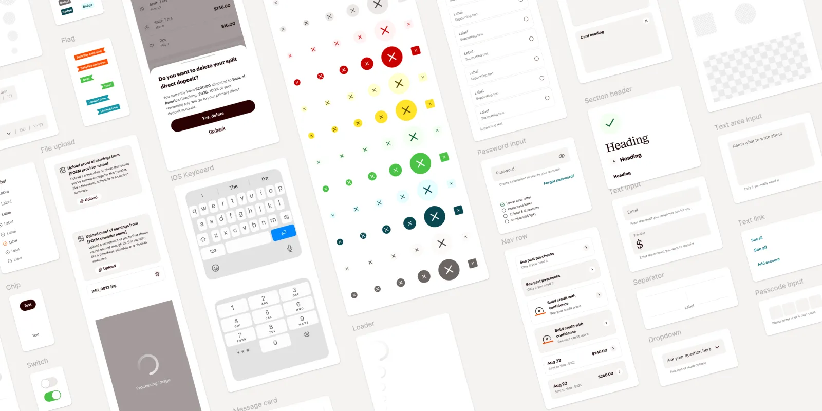
We then built a full suite of reusable UI components for the consumer app in both light and dark mode - spanning close to 40 components, including buttons, inputs, navigation, cards, money inputs, passcode inputs, snackbars and more. Each component was structured for reuse, built with auto-layout and connected back to the token system so design decisions stayed consistent as the product evolved.
But the work didn't stop at components. We created reusable UI patterns and starter templates for common app experiences: actions, cards, carousels, filtering, heroes, lists, navigation, validation and progress states - giving DailyPay's designers a ready made launch point for new product work.
To make the system usable beyond the design file, we documented everything in ZeroHeight: foundations, components, patterns, accessibility, contribution guidance and governance. We produced onboarding material, training videos and handover resources so the DailyPay team could confidently use, maintain, own and extend the system long after the engagement ended.
What came out of it
The engagement delivered more than a design system - it gave DailyPay's product team the foundations to move at a new level of pace and design quality.
Full light and dark mode coverage, a scalable token architecture, close to 40 production ready components, reusable UI patterns and comprehensive documentation - all brought together into one single source of truth for how the app should look, behave and evolve.
The proof came during the project itself. With the system in place, the DailyPay design team redesigned their entire consumer mobile app in dark and light mode in one week.
What had been a fragmented design library became a governed, scalable system, giving designers and engineers a shared language, and giving the product team the confidence to build faster without losing consistency.